One of the things he talked about is a modern look for today's fashion magazines. Its actually a pretty simple three light set up with the model having shiny makeup. It involves a beauty dish and two strip light boxes, all things I don't have.
Here is how a commercial photographer does it. (she is not wearing shiny makeup)
So today I got out all my lights and tried to figure out how I wanted to create this look. I wanted to use a white background because I can control that a bit easier, oh and I own one. I have two strobes with umbrellas and a big garage so I figured I could take the umbrellas and use those instead of the lightboxes and then use my garage door opening as a beauty dish. One flaw, I could not find my second umbrella so I had to think of something else.
Instead I used my garage door opening as the background light and used my umbrella with the silver for the main light. I evened out the ratios of F8 for the background and main light and then got to work.
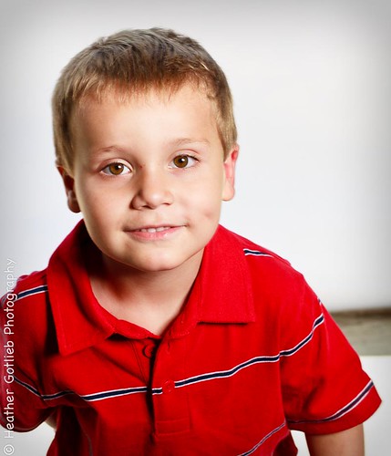
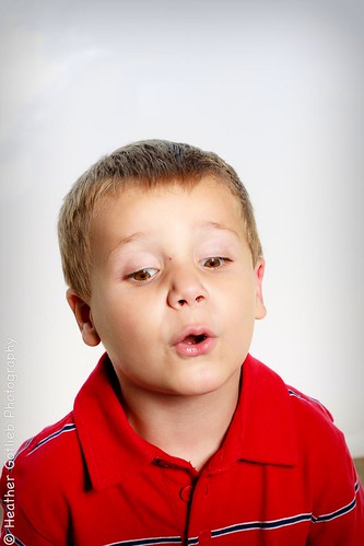
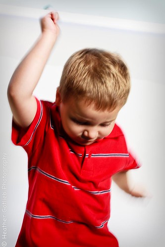
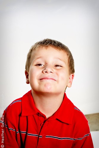
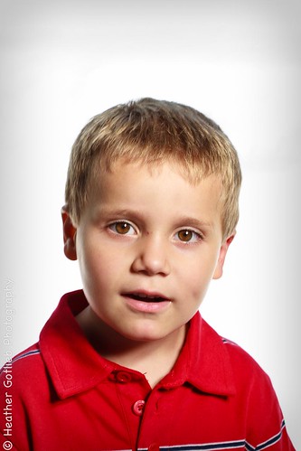
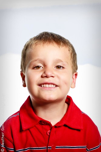
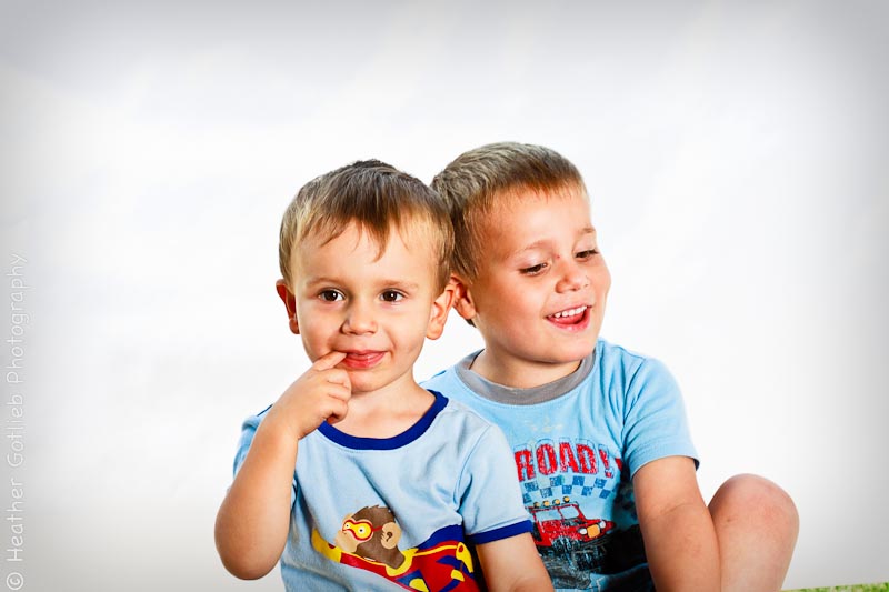
Although I love this affect, I am not sure why I am not in love with these pictures of Erik from today. I really struggled to get something from him. I wanted a half body shot because the cover of his photobook is a square 12x12 and thought a half body look would work better.
Here are a few of my favorites. If you want to see everything click here.
Honestly I think I like the test shots with Erik and Elliot better. They were just feeding off of each other's energy in a silly and good way that was full of emotion.
So I am having a hard time choosing. Tell me what you favorite image is from today. I am thinking of reshoot after nap with a different outfit and maybe a grey background. Not sure yet.


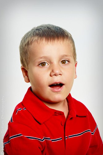



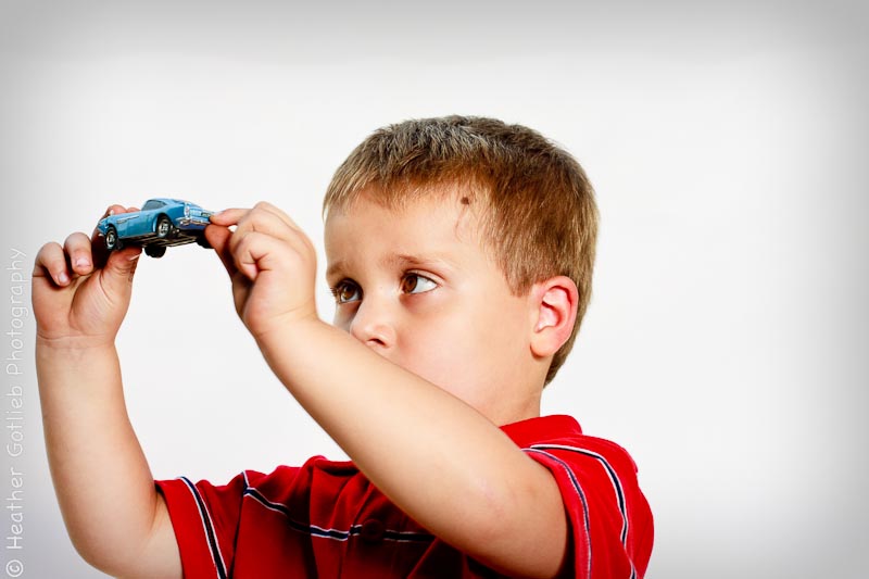

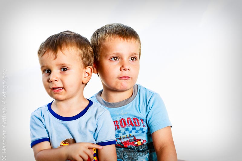

#2 is my favorite . . . have no technical idea why. Such sweet little boys you have!
ReplyDeleteThat is the one I am leaning towards too. Since you know Erik, I can probably see why you choose that. It just seems genuine.
ReplyDelete