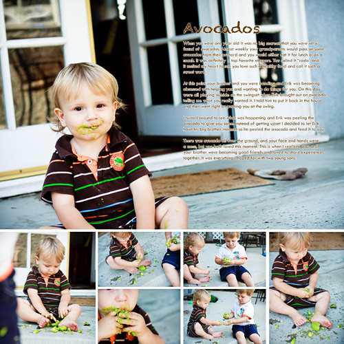
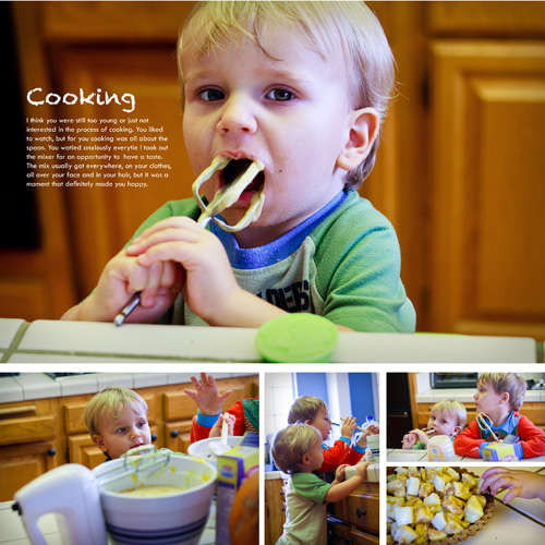
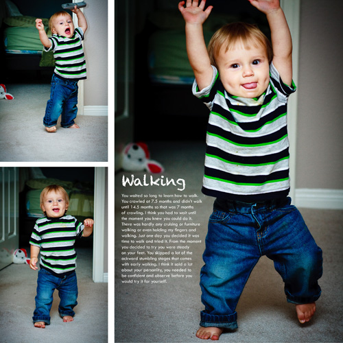
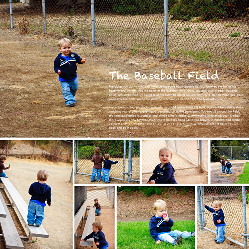
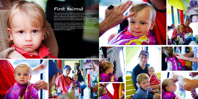
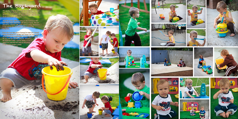
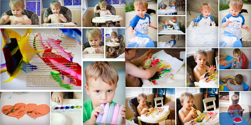
For this year of Elliot's life most of our moments I captured are with my camera and my critical eye and my book is starting to look fantastic. Since I love the photography and the moments I captured so much I decided to let the photos lead the book. So I ditched fancy fonts, background, colors and the such and just went with great big photos.
My background is in graphic design so I can't help myself. All images, text and headers need to be uniform. So in my books you will see two fonts and a couple different colors and that's it. It works for me because I like to keep it simple. In case you are wondering about the technical stuff, I design all my books in InDesign and then export it to jpg. I print them on Shutterfly, but am not married to that service, I just trust the quality.
So here is a sneak preview of what I got done just this afternoon while all the boys were napping.



No comments:
Post a Comment